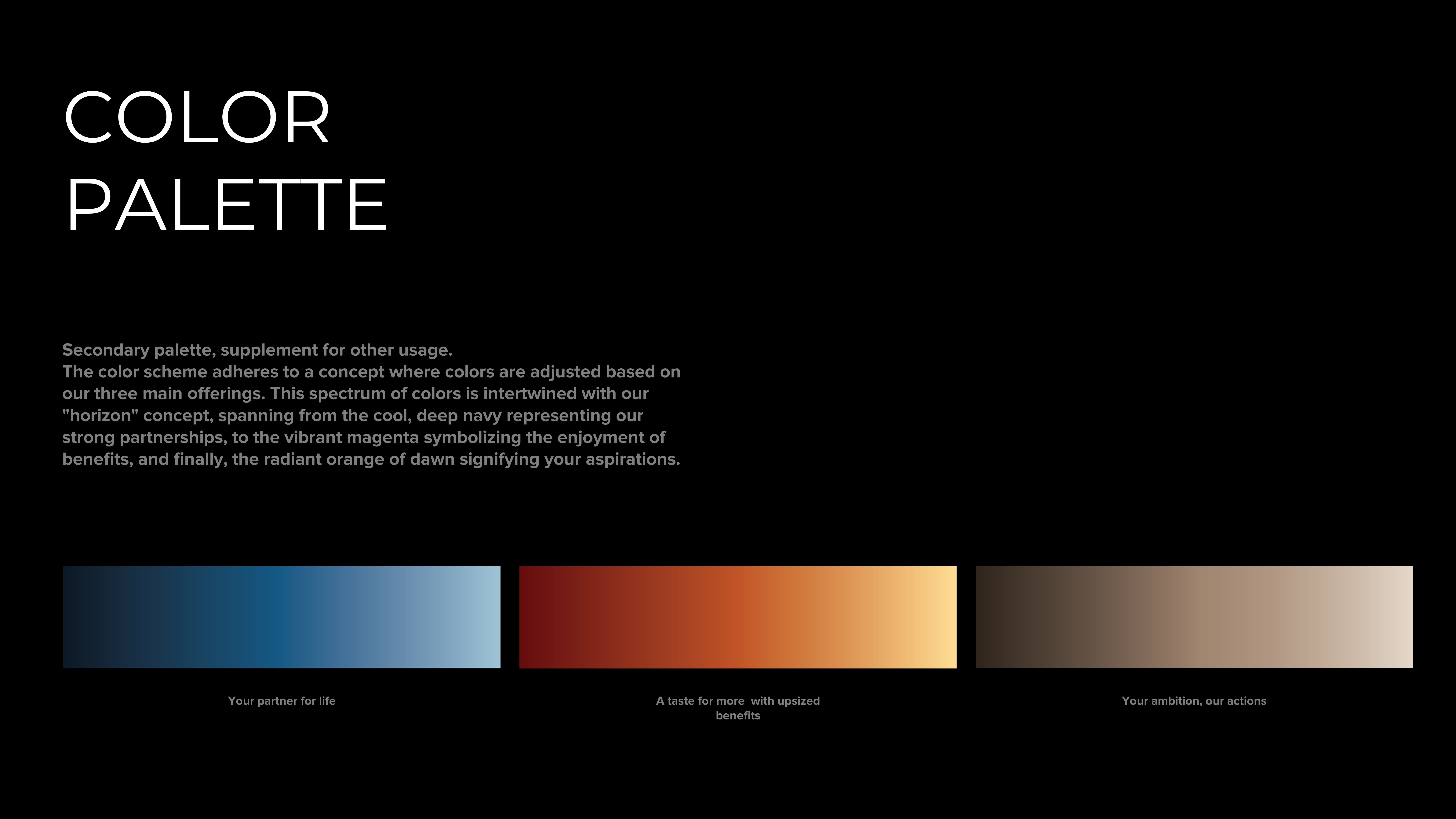
Techcombank Priority is a visual identity built on narrative structure and evolving tone. Crafted for a rising segment, the system leverages spatial composition and material symbolism—anchored by a horizon motif that captures transition, ambition, and forward movement.
ABOUT
Success isn’t just about moving forward — it’s about moving with purpose.
As clients enter a new phase of wealth and decision-making, they need a system that reflects both structure and ambition — not just tools, but a sense of clarity and direction.
BRAND POS
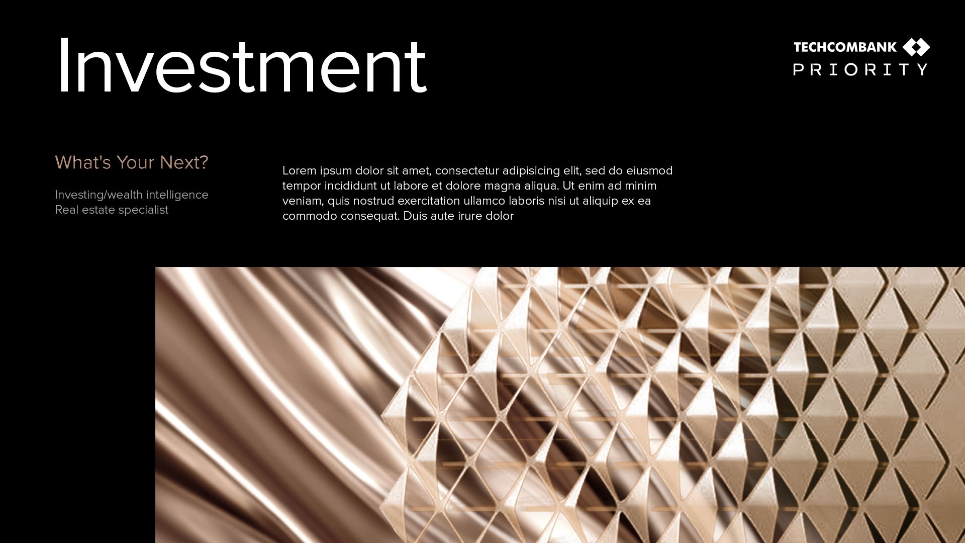
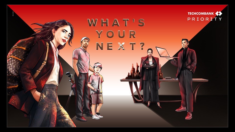
Techcombank Priority
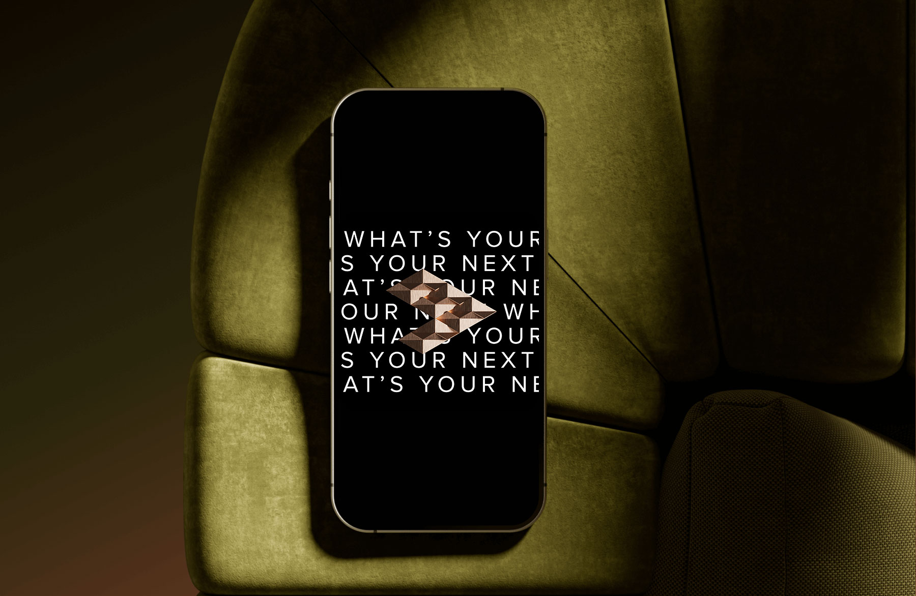
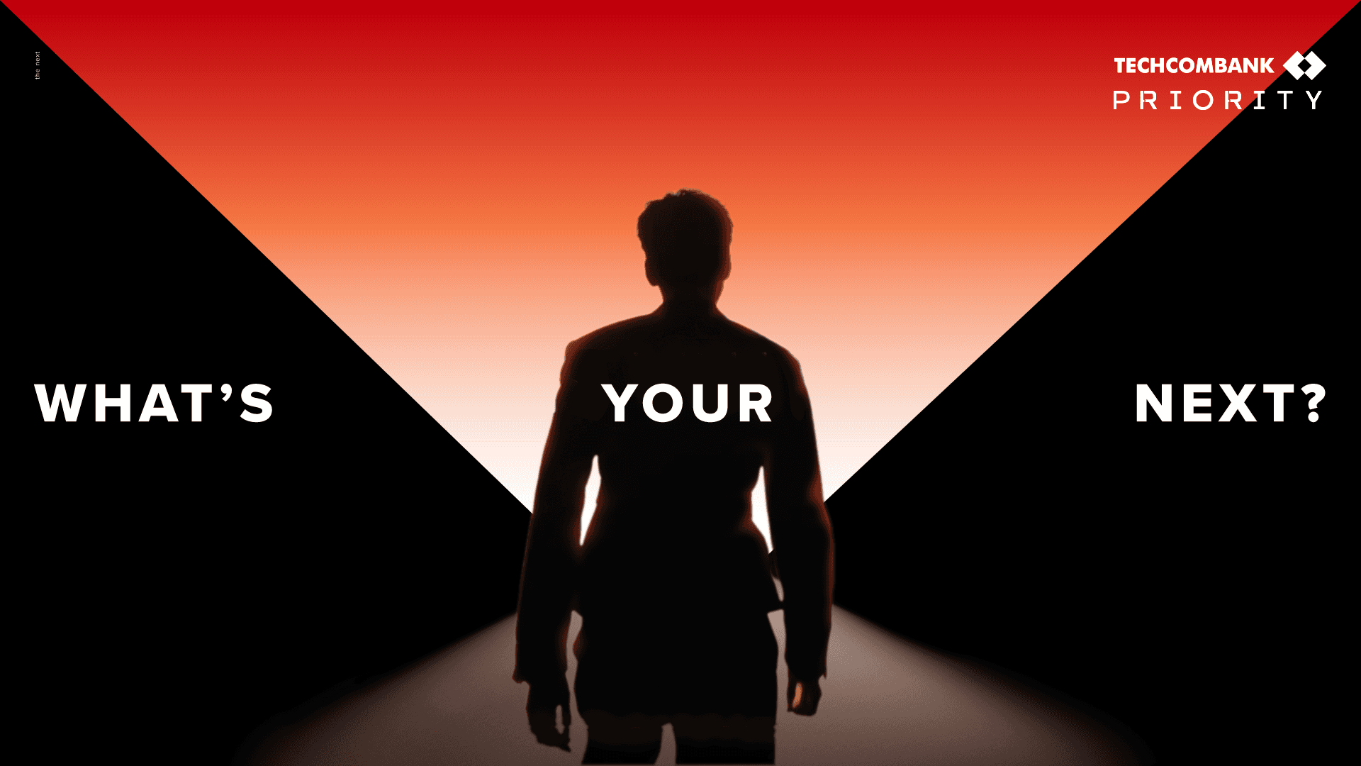
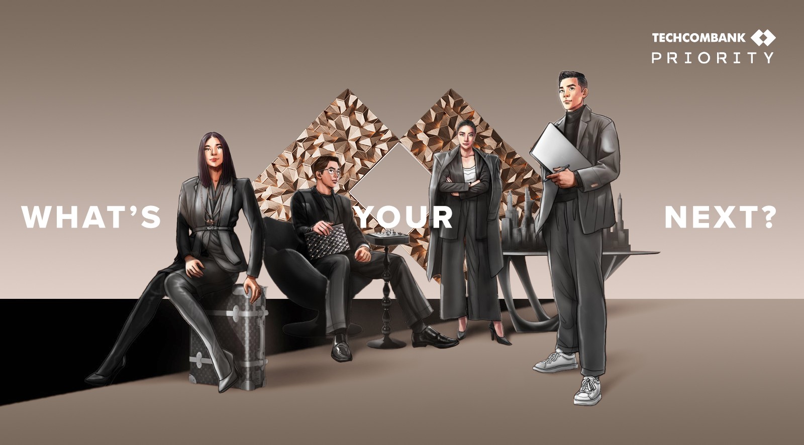
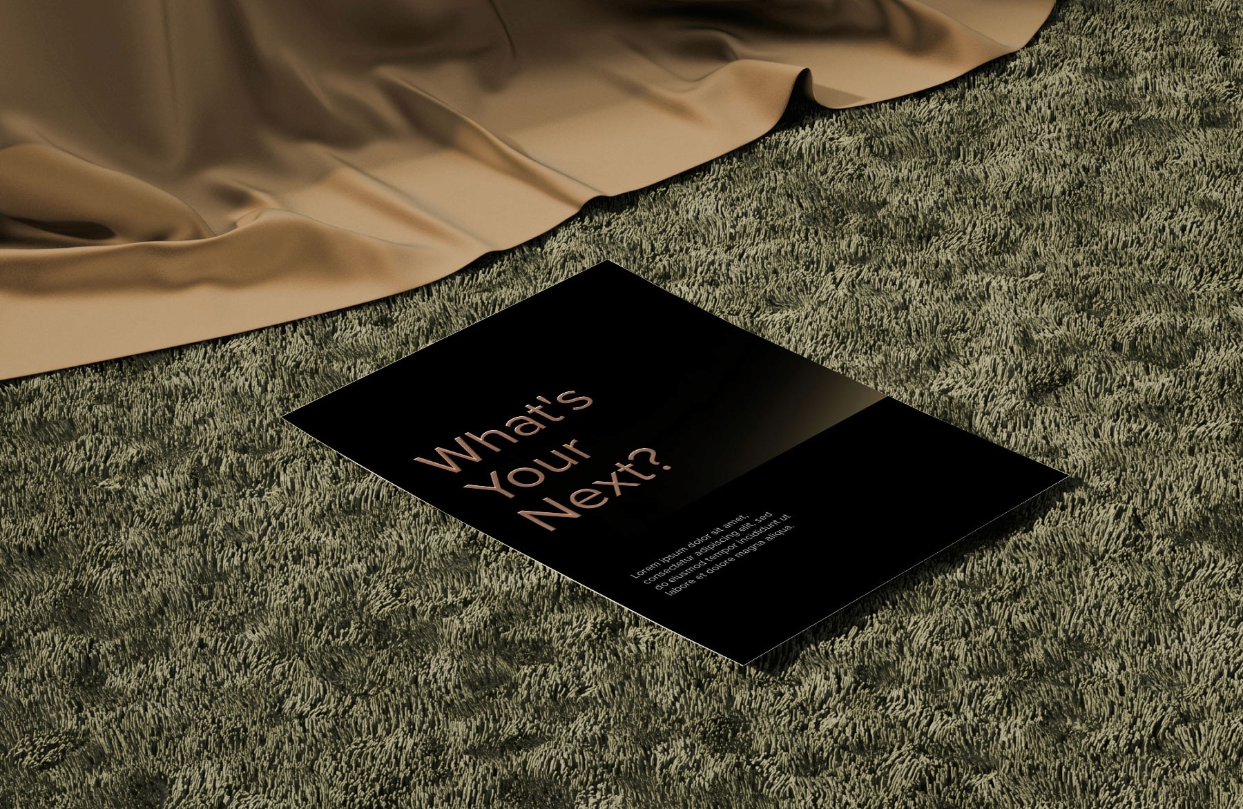
What's Your Next?
Project Details
Client
Techombank
Year
2024
Role
Art Director
3D Designer
Motion Lead
Techcombank Priority is a visual identity built around structure, clarity, and purposeful progression.
Designed for a rising class of leaders and decision-makers, the project combines spatial composition with material symbolism — anchored by a horizon motif that captures ambition and forward movement.
The concept phase was driven by exploration — testing form, motion, and tone to find the right balance between structure and emotion.
CONCEPT

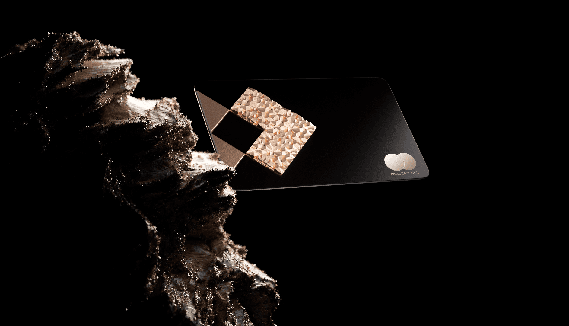
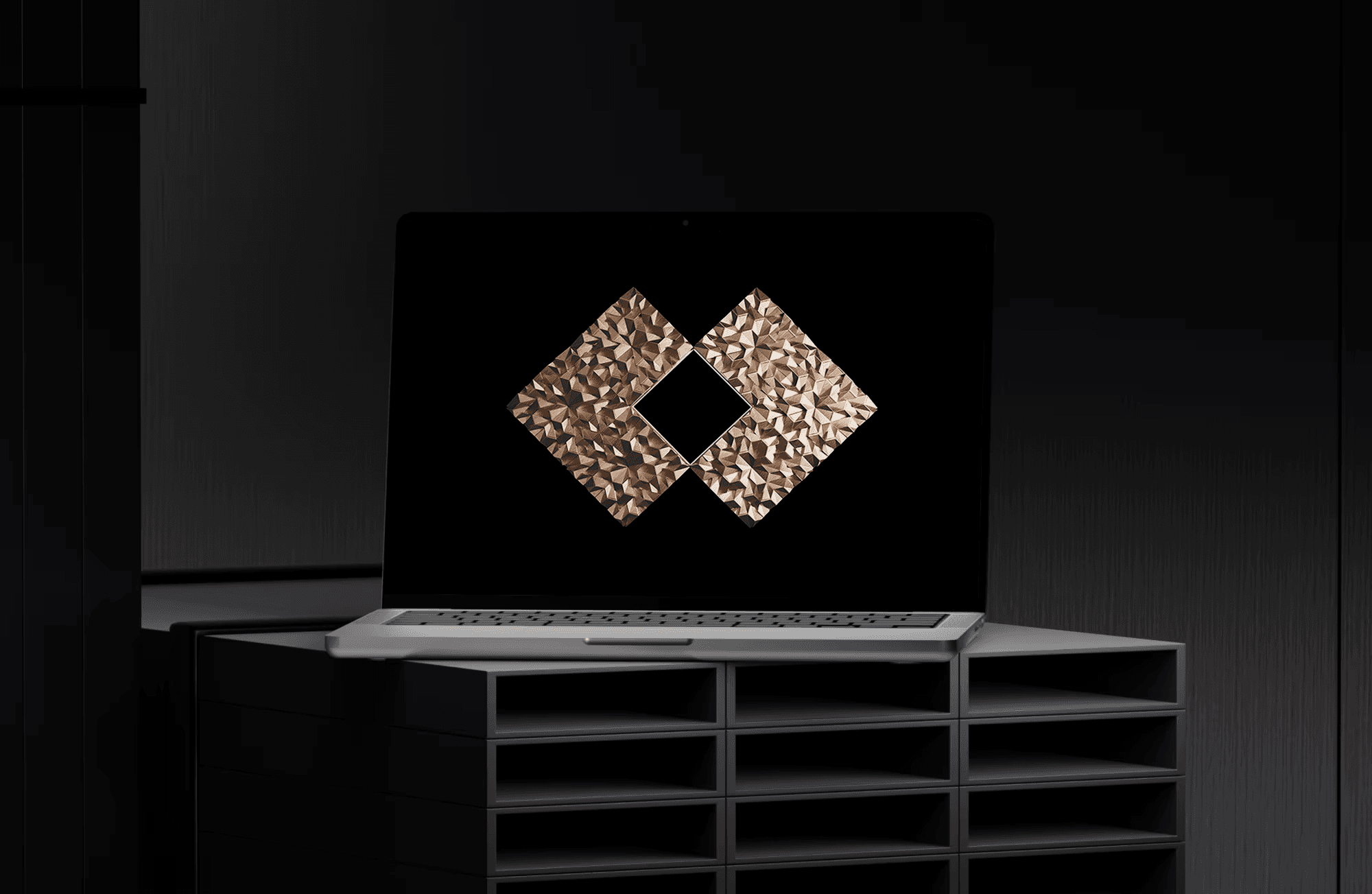
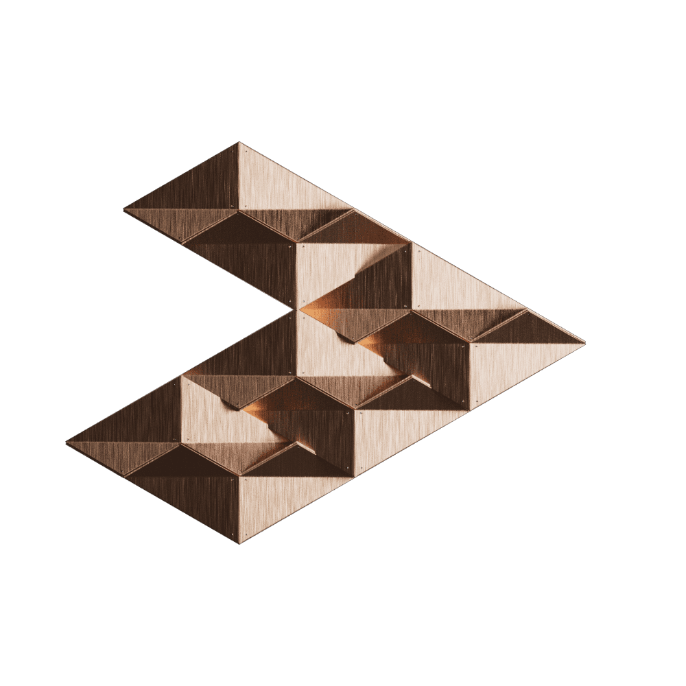
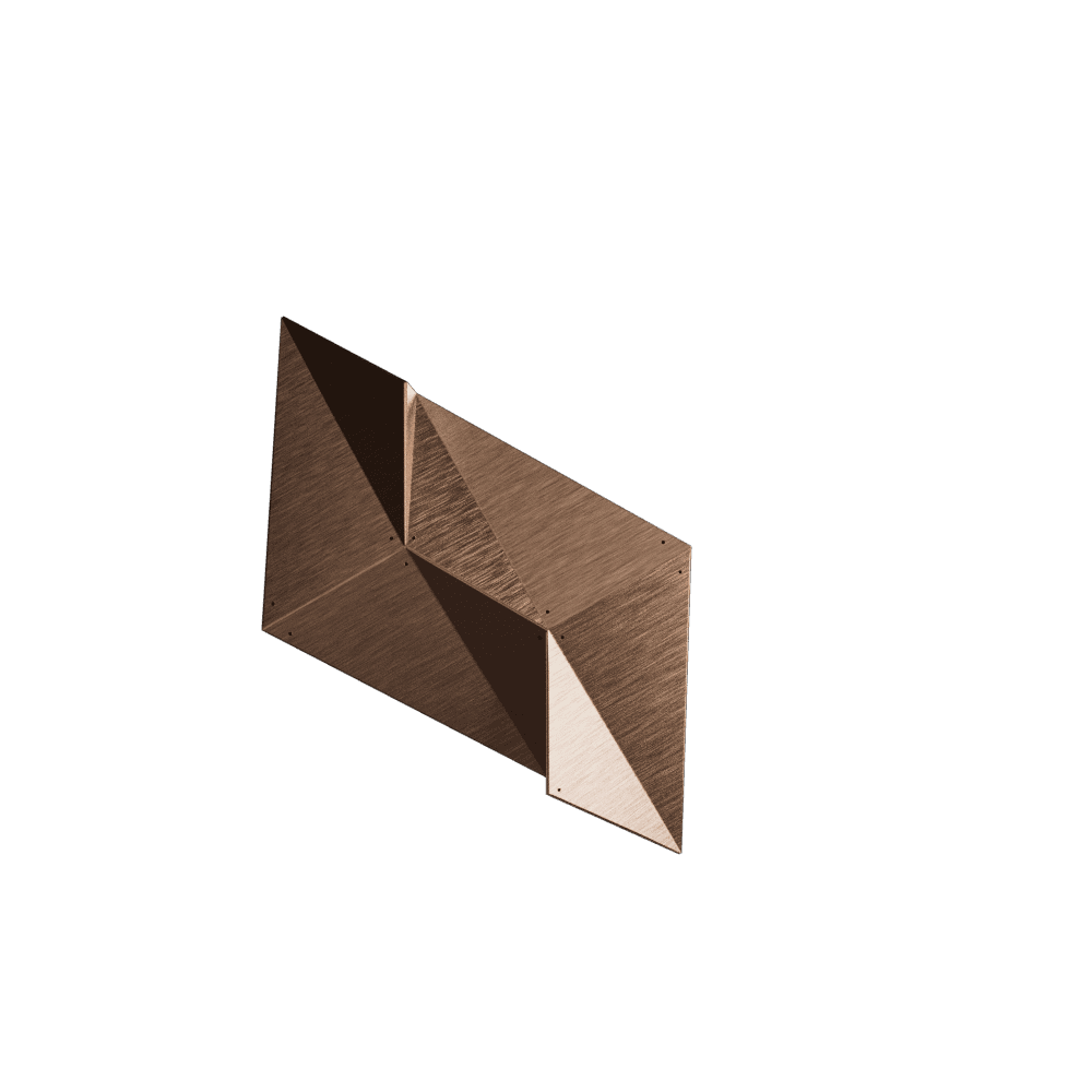
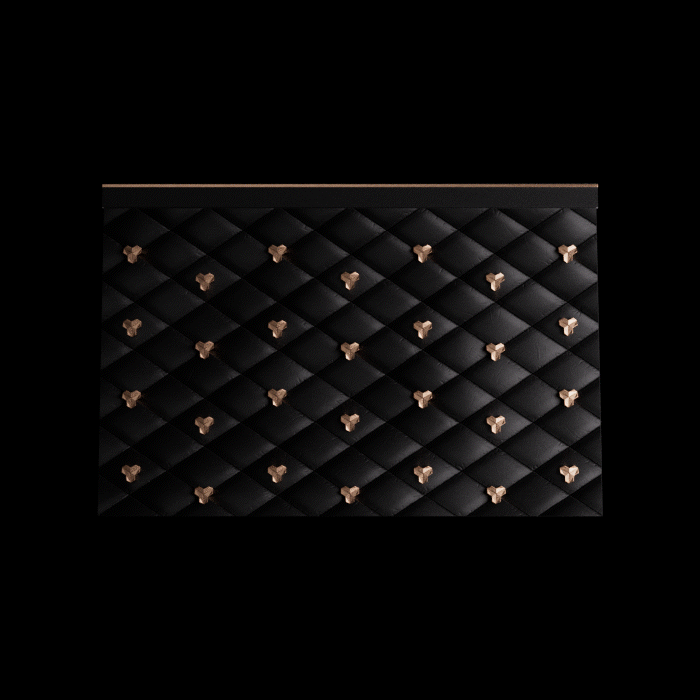
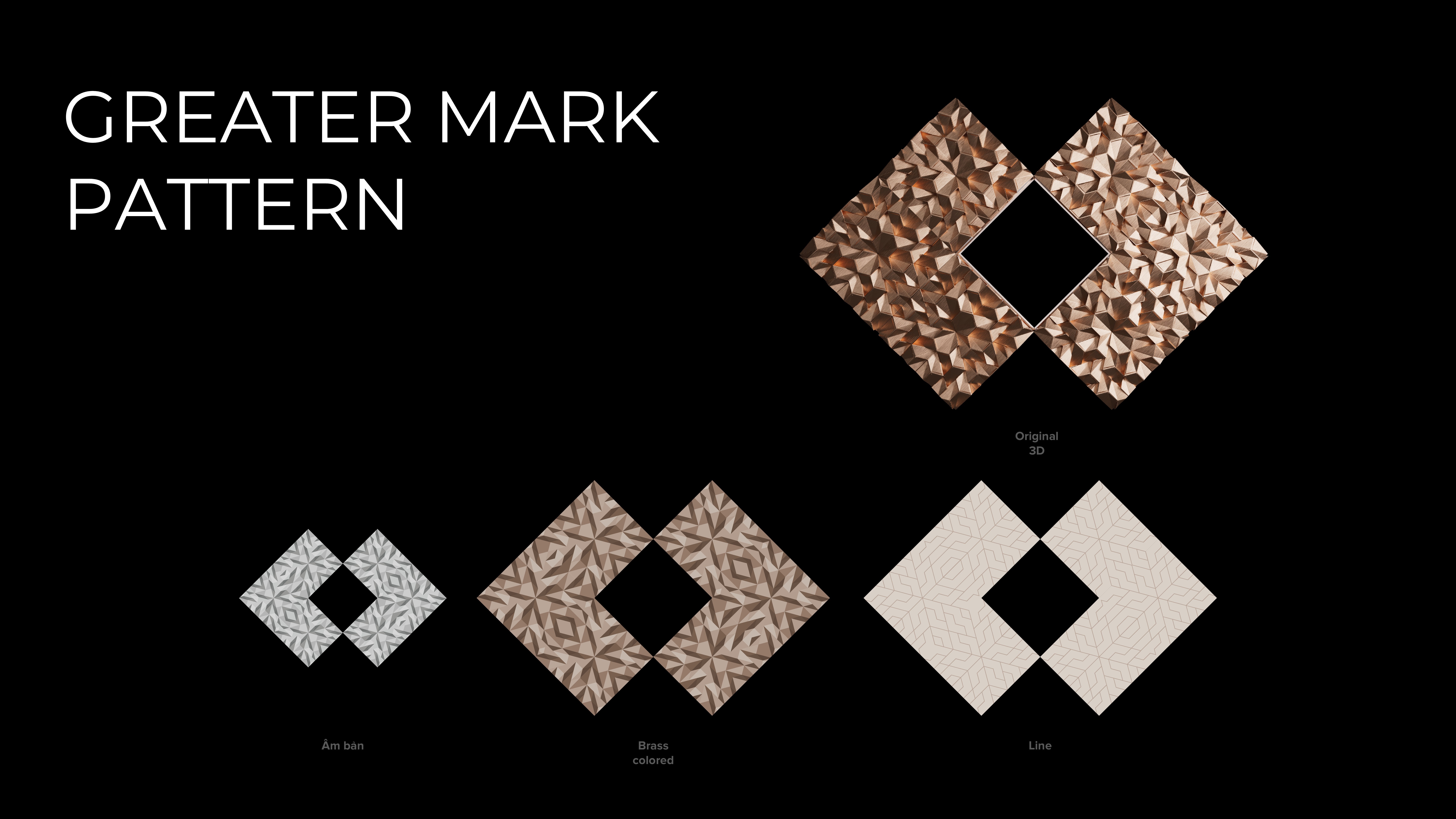
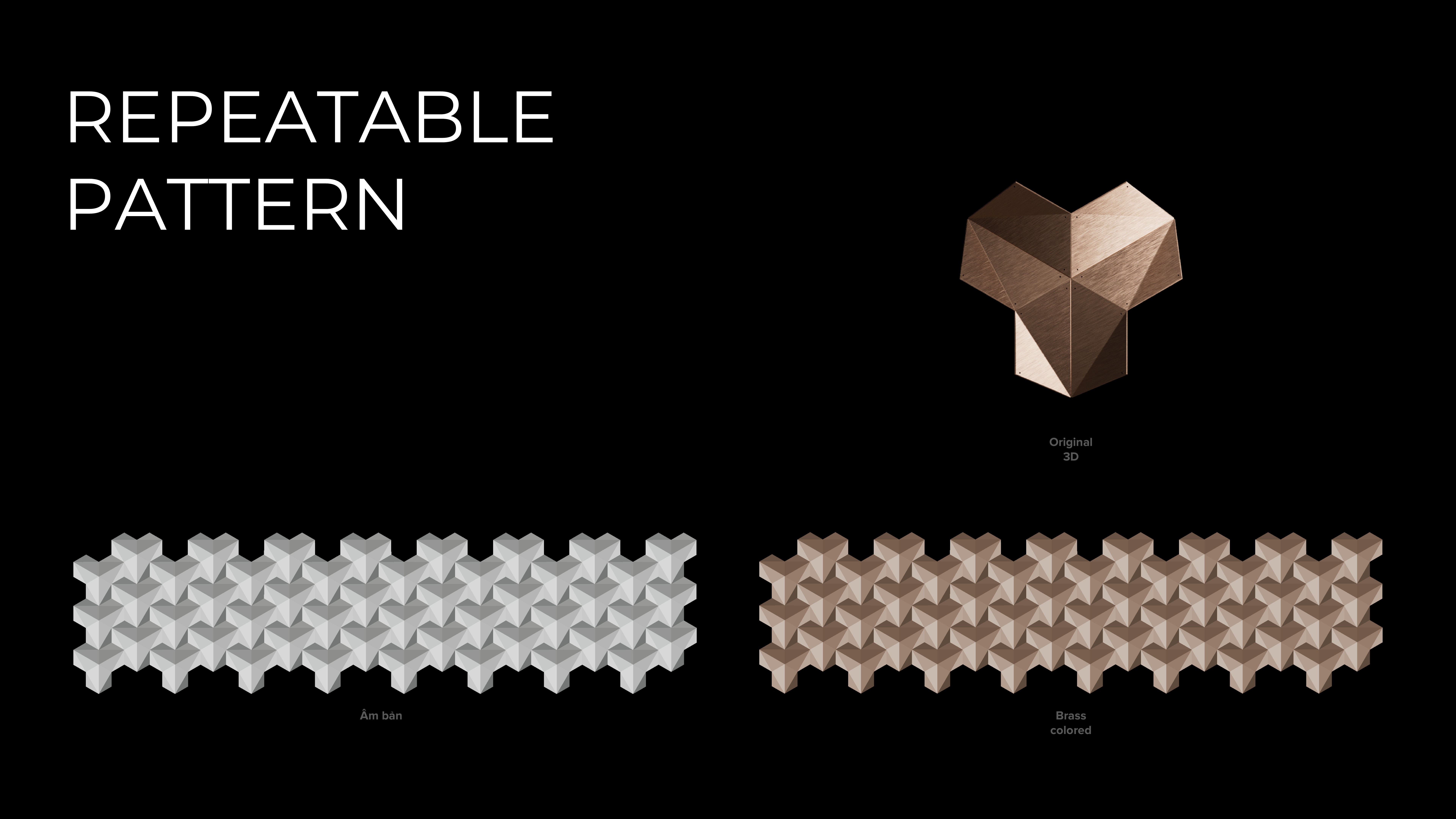
The foundation of the visual system was a modular “building block” — a sculptural form inspired by premium product design and advanced tech aesthetics. Crafted to echo architectural precision and futuristic intent, this shape served as a core visual device throughout the campaign — from hero keyframes to spatial UI systems. Its beveled geometry and metallic surface subtly referenced high-end industrial design, aligning with TCB Priority’s values of clarity, structure, and forward momentum.


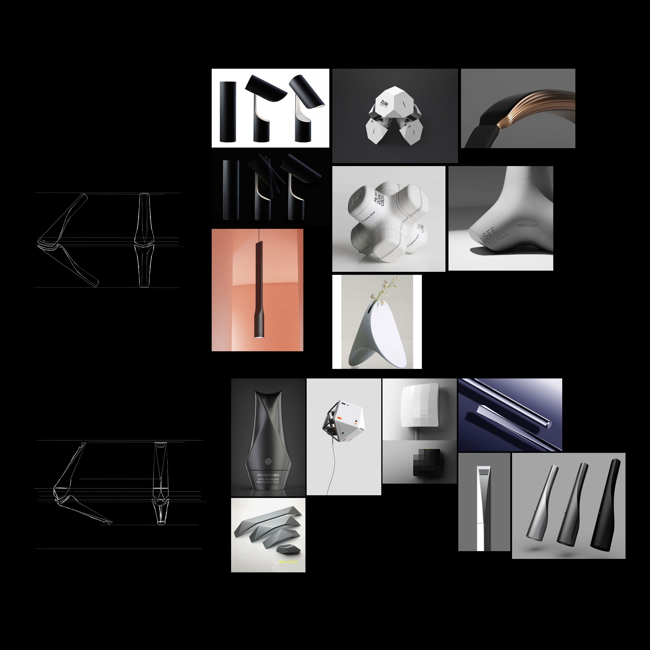


Designed with scalability in mind, the building block was crafted as a flexible unit — capable of interlocking, rotating, and repeating to form endless compositions. From structural grids to symbolic icons, this modularity allowed the system to adapt seamlessly across formats, reflecting both the precision of tech architecture and the ambition of the brand. The visuals here showcase its expressive range: expanding from single forms to dense clusters, evoking growth, momentum, and structured transformation.

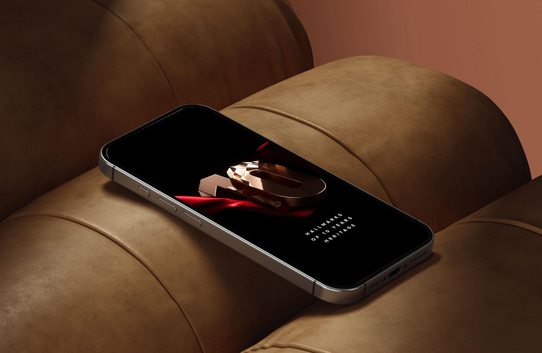
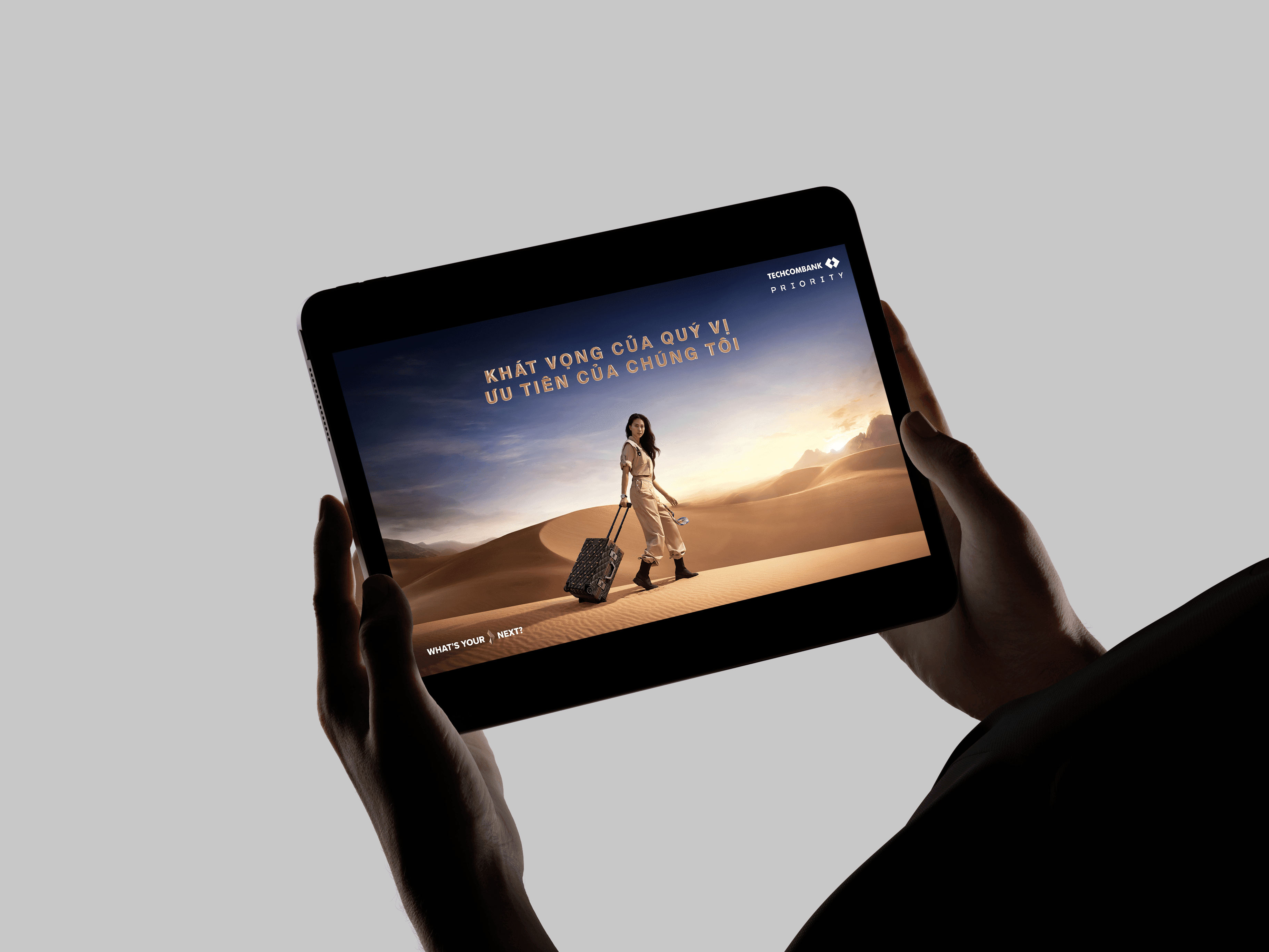
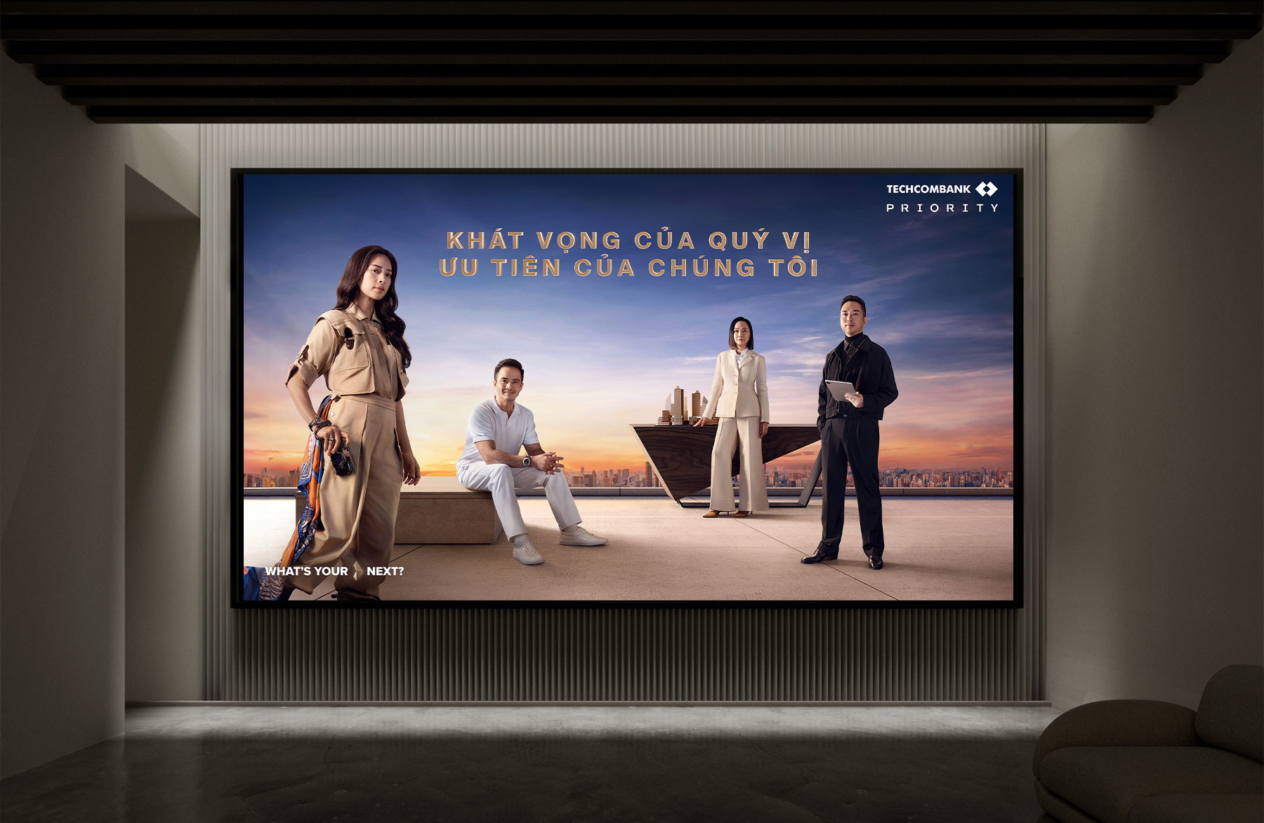
Building on the core visual system, the Key Visual distills the campaign’s essence into a singular, iconic composition — setting the tone for all branded touchpoints.
KEYVISUAL
Key Visual
Exploration
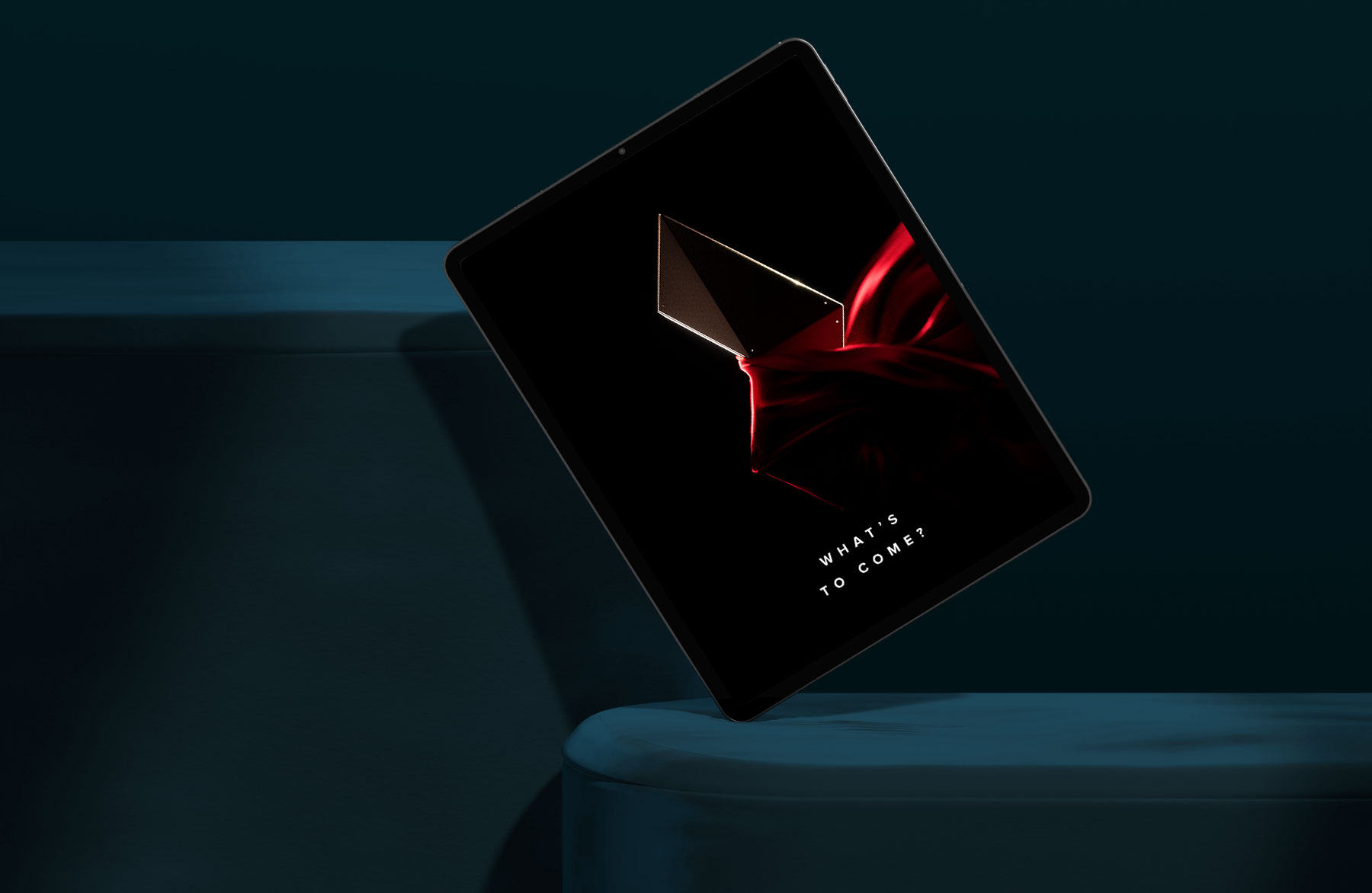
The Key Visual exploration began with a stylized, fashion-forward look to express status and modernity.
It later evolved into a more symbolic direction — using the horizon line as a central motif to reflect ambition, clarity, and the long-view mindset of Priority clients.
This shift allowed the visual to speak not just to style, but to purpose and progression.


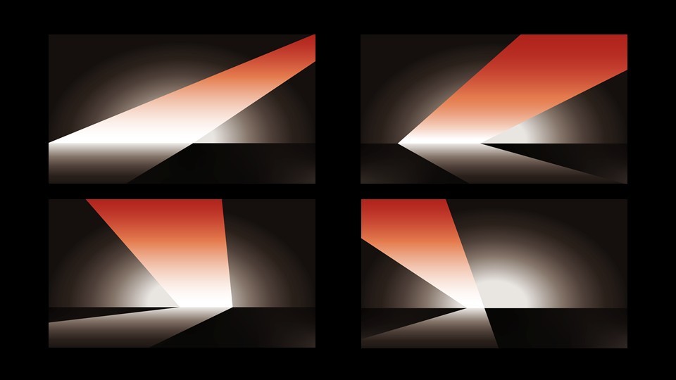
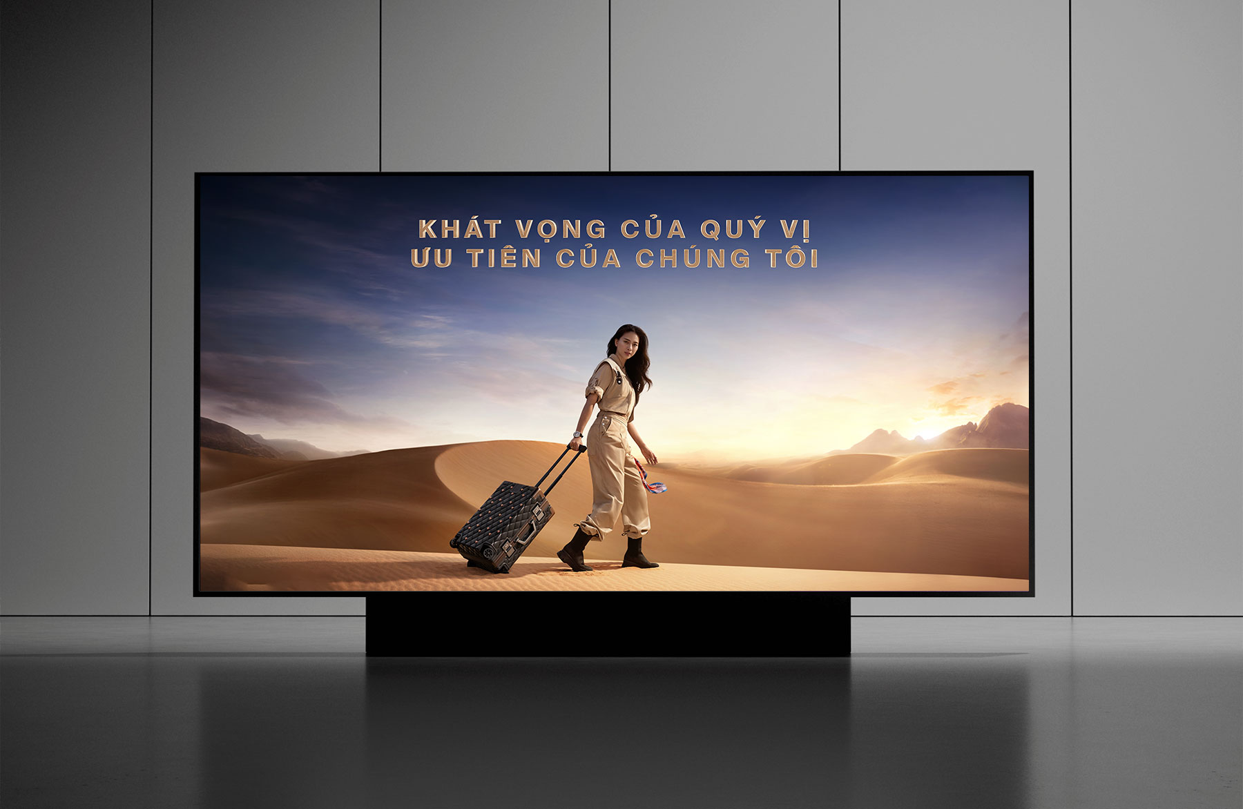
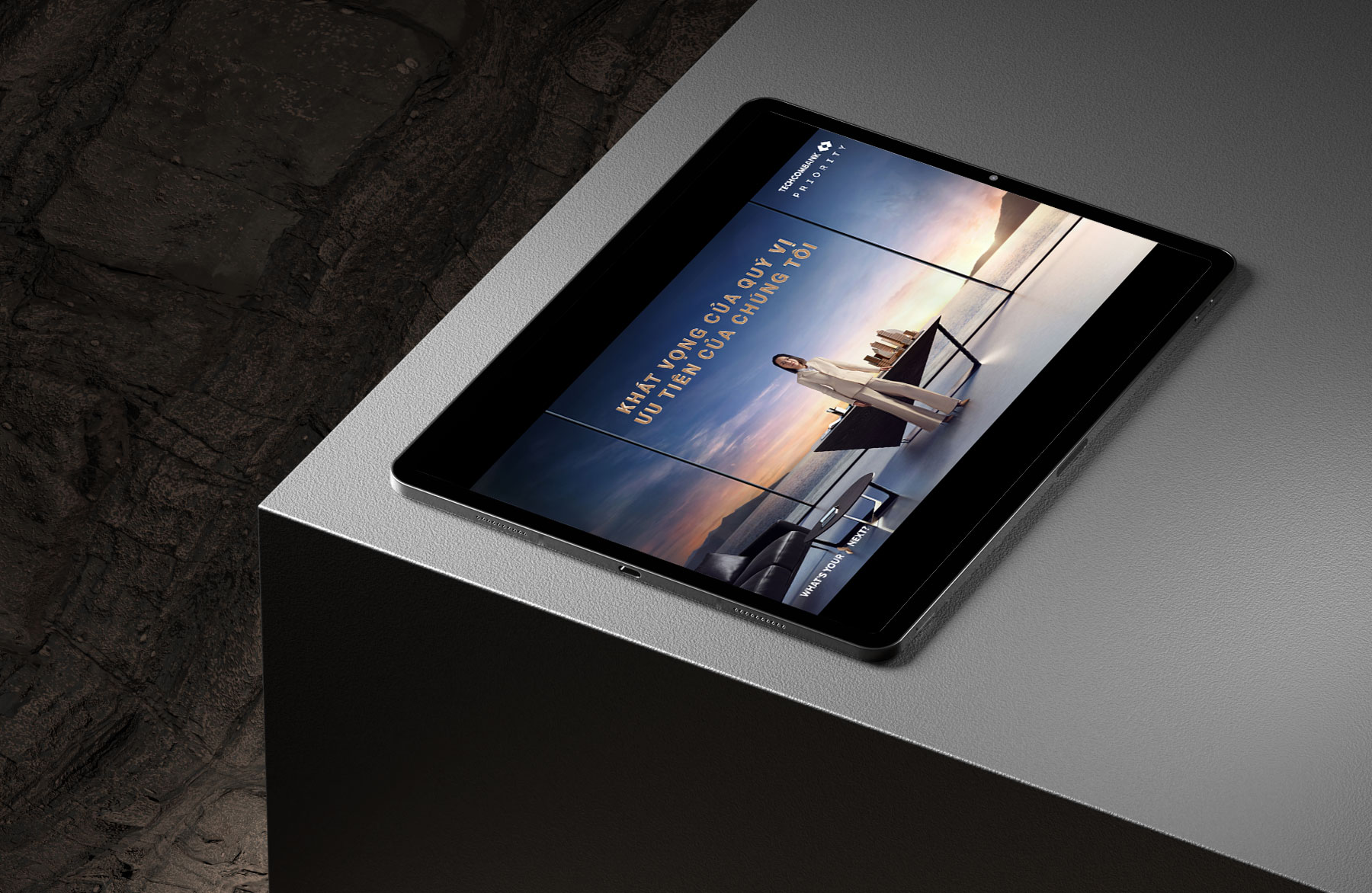
Evolving from the Visual Cue, the identity unfolds into adaptive content — reshaping itself across formats while preserving the same visual rhythm and crafted precision.
Every extension carries the spirit of the core, adapting without losing its voice.
ADAPTIVE
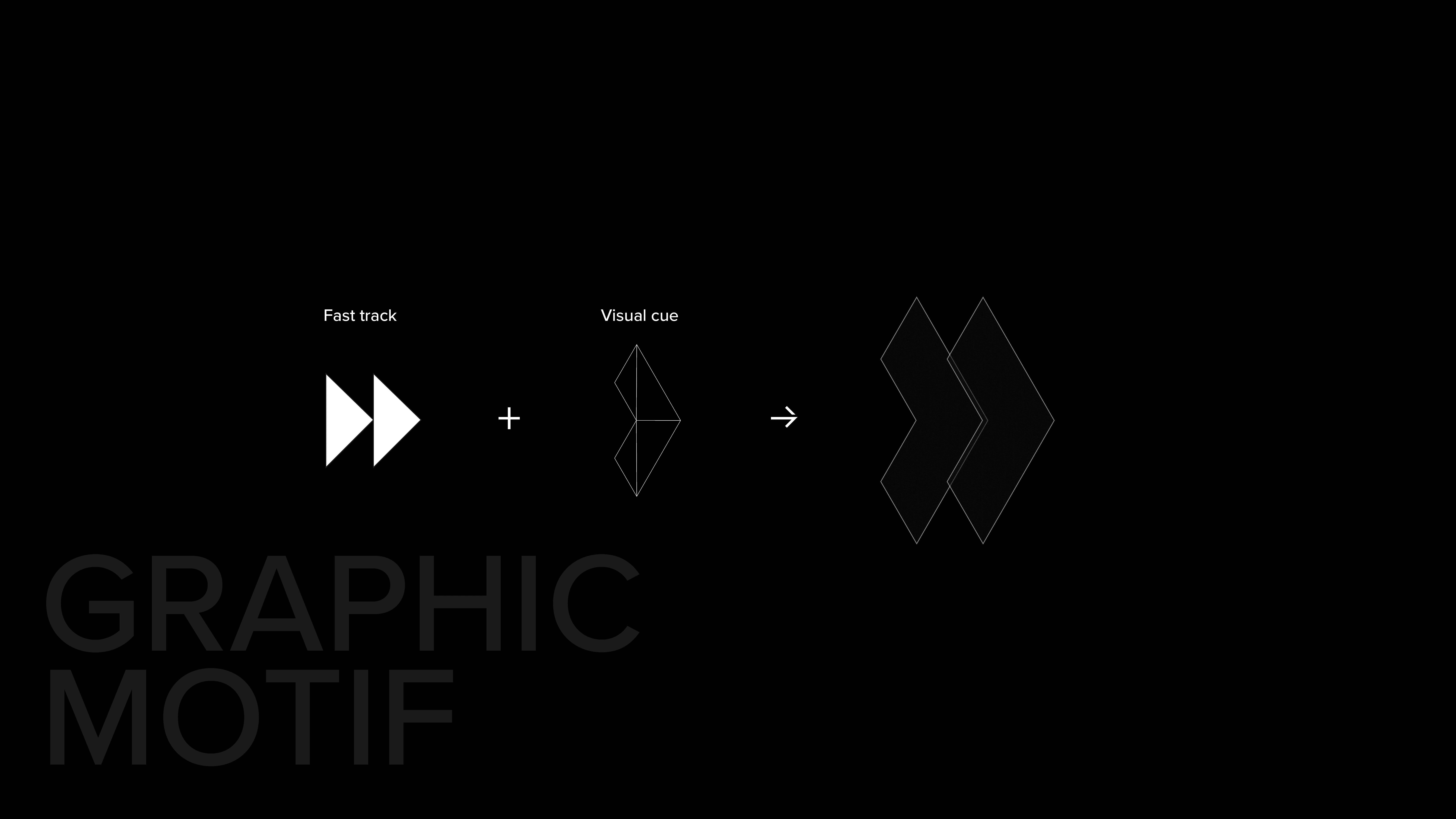
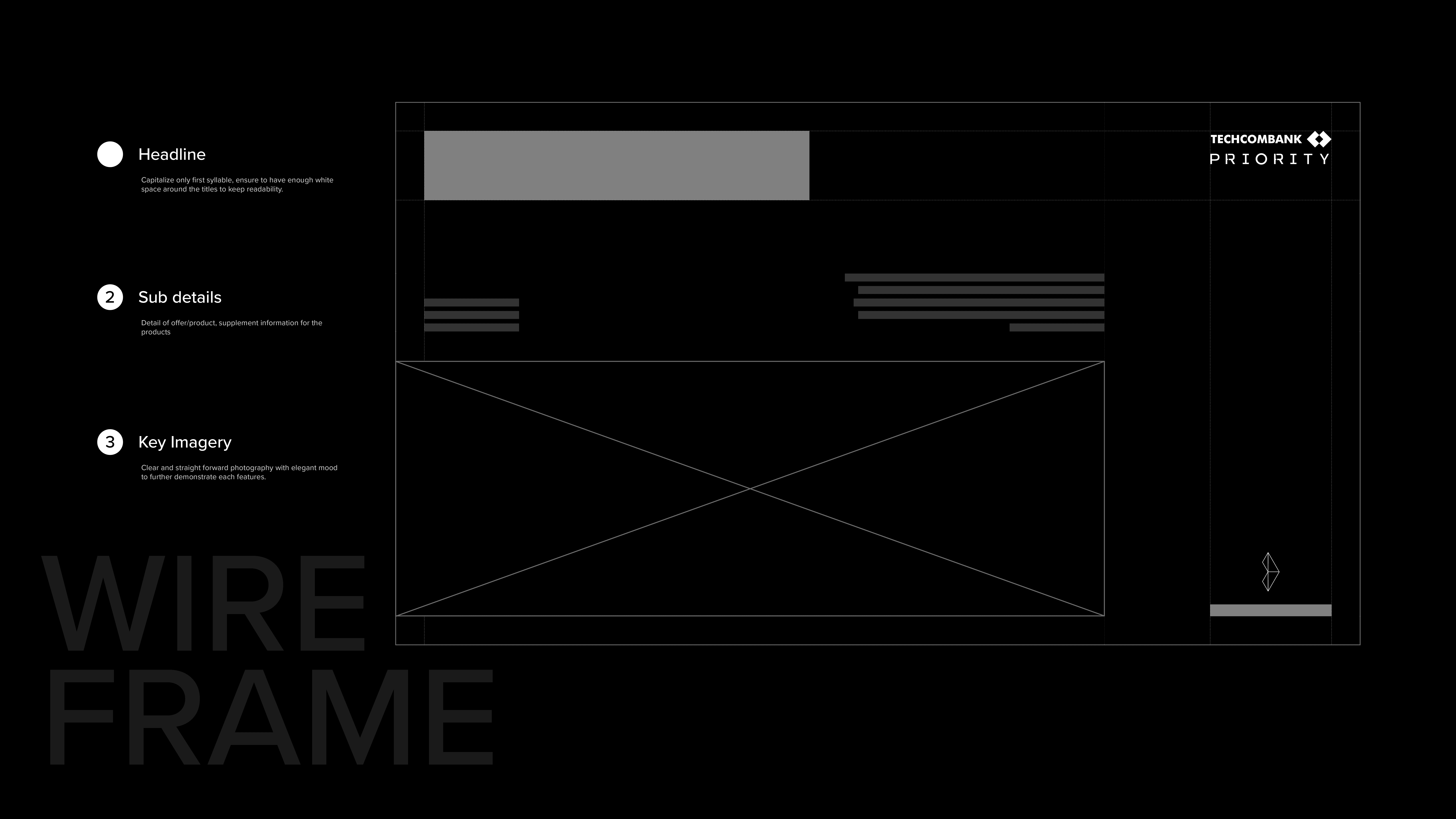
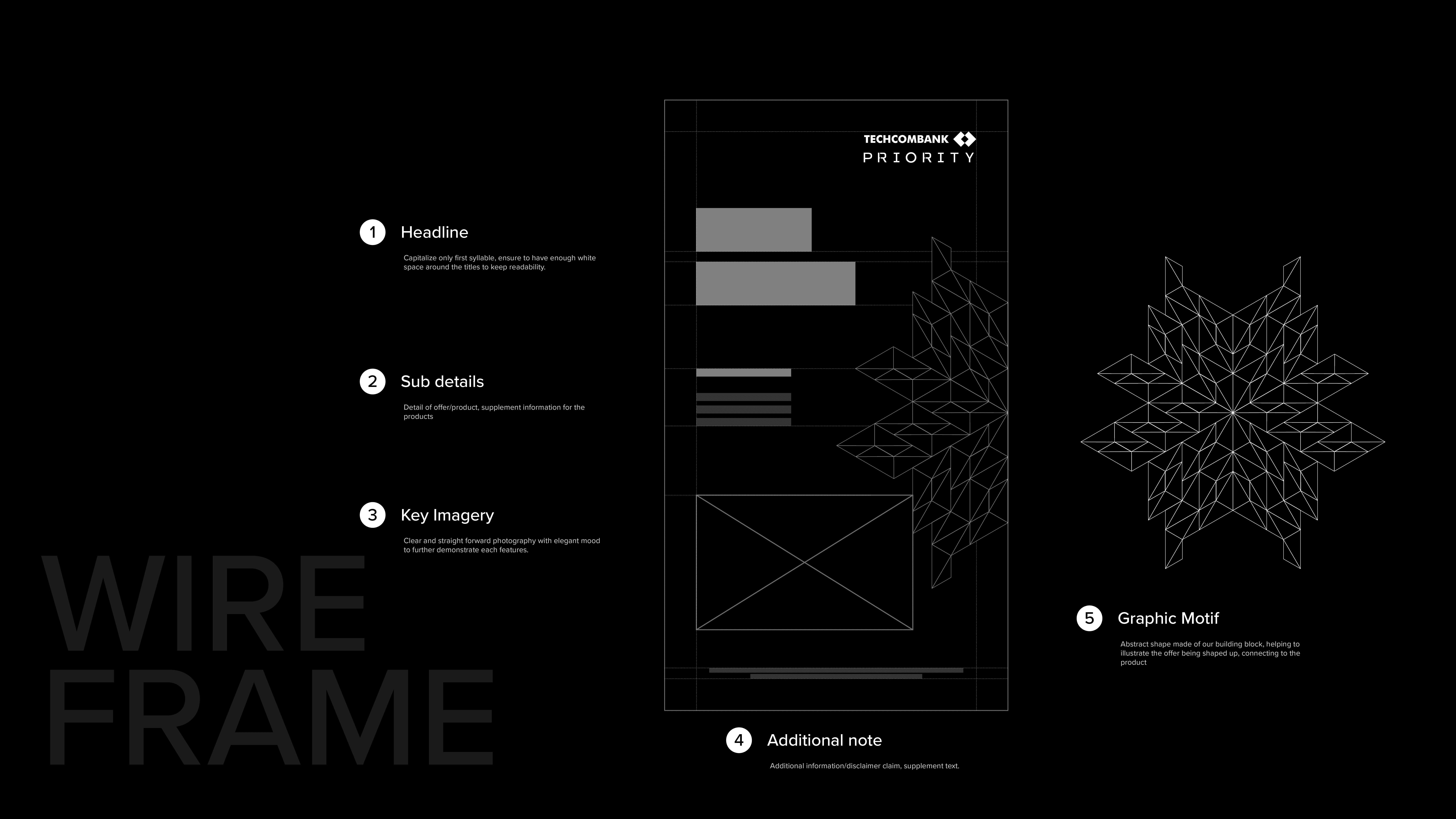
The graphic motif was developed by abstracting the core visual cue. This motif became the backbone for layout compositions across print and digital, supported by a custom wireframe system that ensured consistent alignment, rhythm, and brand expression across all touchpoints.
The result is a flexible yet cohesive visual language that reinforces movement, clarity, and priority throughout every asset.